Nearly 50 years ago, the Milwaukee Brewers introduced one of the greatest sports logos of all time, the iconic “Ball-In-Glove” logo. The design quickly became a modern classic and a symbol for the Brewers, the community around Milwaukee, and baseball fans alike. So why after almost two decades was the logo replaced, and why did it take the team so long to bring the logo back? In today’s video we’ll take a look back at how this legendary logo came to be and why it has remained so popular to this day.
From Seattle to Milwaukee
The Milwaukee Brewers story actually begins in Seattle, when in 1969 Major League Baseball expanded and added four new teams to the league. The San Diego Padres and Montreal Expos joined the National League, while the Kansas City Royals and Seattle Pilots joined the American League. After only one season, the Seattle Pilots found themselves in deep financial trouble and were heading for bankruptcy. Immediately following the conclusion of their first season, Pilots owner Dewy Soriano met with car salesman and former Milwaukee Braves minority owner Bud Selig about selling the team to Selig. Both sides met over the course of several weeks, and during game one of the 1969 World Series, the two men agreed on a deal for $10.8 million dollars. Though the sale wasn’t finally approved by MLB until a week before the season began in 1970. So that year on April 1, the Seattle Pilots officially relocated to Milwaukee and changed their name to the Brewers. The team decided on the name “Brewers” as a homage to the defunct minor league baseball team, the Milwaukee Brewers who played from 1902 to 1952. By adopting the name “Brewers,” the MLB team in Milwaukee not only connected with the city’s brewing history but also embraced the legacy of the earlier baseball team, creating a sense of continuity and nostalgia for longtime baseball fans in the area. Because the approval for the sale of the team happened so late, the team had little time to do a major overhaul of the club’s colors and logos. Originally, Bud Selig wanted the Brewers to wear blue and red jerseys, much like the Braves did when they were in Milwaukee. But due to the time constraints, the Brewers were forced to use the same blue and gold jerseys that the Pilots wore the season before (just with updated naming). As for the logo, the Brewers opted for a simple “M” logo on their caps, which was also a nod to the block M logo that the Milwaukee Braves used. During this time, the Brewers also introduced the “Barrelman” logo which was inspired by a similar Barrelman logo that the minor league Milwaukee Brewers had also used. The Block “M” and Barrelman logos would remain as the primary branding for the Brewers for eight seasons.
Designing the Logo
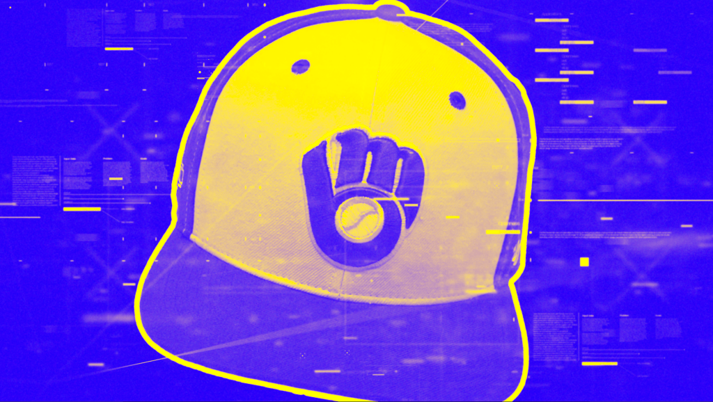
By the late 1970’s, the Brewers were looking to update their branding and phase out the Barrelman logo. Since the move to Milwaukee, the club had become the definition of mediocrity, finishing each of their eight seasons just below .500. So Bud Selig, looking to make wholesale changes, decided to fire many of the top people in the organization to shake things up. During this time, the team also held a design contest for a new logo. A 30 year old college art student named Tom Meindel submitted what would become the winning design. In Meindel’s original concept, the now iconic, “Ball-In-Glove” logo had brown and yellow colors and featured hidden elements. The fingers on the baseball glove portion of the logo, when isolated, makes an “M” shape for Miluwakee. The thumb and pocket area of the glove form the letter “B” for Brewers, with a baseball in the middle. When all put together, it forms the letters “M-B” for Milwaukee Brewers. Meindel allegedly was in a psychology class one day and was drawing the margins of his notebook when he came up with the logo idea. In his design process, Meindel had this to say about coming up with the ball-in-glove idea, “I remember working with the M and B and I was stuck…I wasn’t going anywhere. Then I decided to start using lower case letters. The obvious thinking was to put them side-by-side, but I thought ‘let’s stack it, one on top of the other.’ It was a very crude drawing, but all of a sudden, boom, the light bulb came on. It reminded me of a baseball glove.” Meindel received $2,000 for the winning design, (roughly the equivalent of just over $10,000 today) though he did not receive any royalties for the logo. The new branding proved to be a hit, and the Brewers also improved their play on the field. They finished the 1978 season with a 93-69 record, which earned Bud Selig the Major League executive of the year award. The Brewers new found success would carry on into the following seasons, with the team clinching the American League pennant in 1982, earning them their first ever World Series appearance. With that, the club continued to use the Ball-In-Glove logo for the rest of the 1980’s and into the early 1990’s.
The Ball-In-Glove Returns
The 1994 season marked the 25th anniversary of the team relocating to Milkwaee from Seattle. To honor the occasion, the club thought it would be a good idea to retire the Ball-In-Glove design for an updated, more contemporary logo for the times. The new logo, showing interlocking letters “M-B” in front of two baseball bats and a baseball diamond, introduced the color green to the club for the first time. The club also switched from their classic yellow and blue, to a more muted gold and navy blue. The Brewers would use this logo for the rest of the 1990’s, until the year 2000, when they introduced an updated logo to mark the final season of the club playing at Milwaukee County Stadium. The new logo featured the word “Brewers” in front of a baseball, with two stems of barley underneath (as barley being a key ingredient to beer making). The team would use this logo, and a simplified letter “M” version of it introduced in 2017, until the club’s 50th anniversary in 2020. As with the 25th anniversary, the team wanted to celebrate the major milestone of 50 years in Milwaukee by rebranding with new logos. This time, the club decided to use feedback from fans who overwhelmingly wished to bring back their most beloved icon, the “Ball-In-Glove” logo once more. A new design was introduced that updated the classic look. For the 2020 version, the “M” and “B” parts of the logo were connected for the first time. In Meindel’s (MINE-DEL) original design, the two letters had always been separated. The colors were also updated to reflect the Brewers continued use of navy blue rather than the royal blue that the team had used before. However, for the club’s primary logo, a circular version of the logo uses a royal blue outline that underscores the words “Milwaukee Brewers,” as a nod to those successful years during the late 1970’s and early 80’s. In another homage, the yellow outline and circular text is also a nod to the classic Barrelman logo that also used a similar design. Throughout the club’s history, the iconic ball-in-glove logo holds a timeless legacy, deeply ingrained in the team’s history and beloved by fans worldwide. It serves as a beacon of unity for fans, a reminder of fond memories on the diamond, and a symbol of the team’s and city’s unique past. In 2011, Bleacher Report ranked the 50 best baseball logos of all time and placed the Brewers’ Ball-In-Glove logo number 8 on their list, while surprisingly placing the Barrelman logo at number 2. In any case, whether the logo is adorning merchandise, banners, or the players’ uniforms, the ball-in-glove logo remains a cherished emblem of the Brewers’ legacy, connecting generations of fans and players alike in their shared love for the game.
So what did you guys think about Bleacher Report ranking the Brewers logo as number 8 on their all time baseball logos list? Would you place it higher or lower on the list? Let me know in the comments below!
If you guys enjoyed this video, check out my video on what happened to the Seattle Pilots which goes further into the Pilots time in Seattle before they moved to Miluakee and became the Brewers. As always, please like and subscribe if you haven’t already and thanks for watching!

Leave a comment