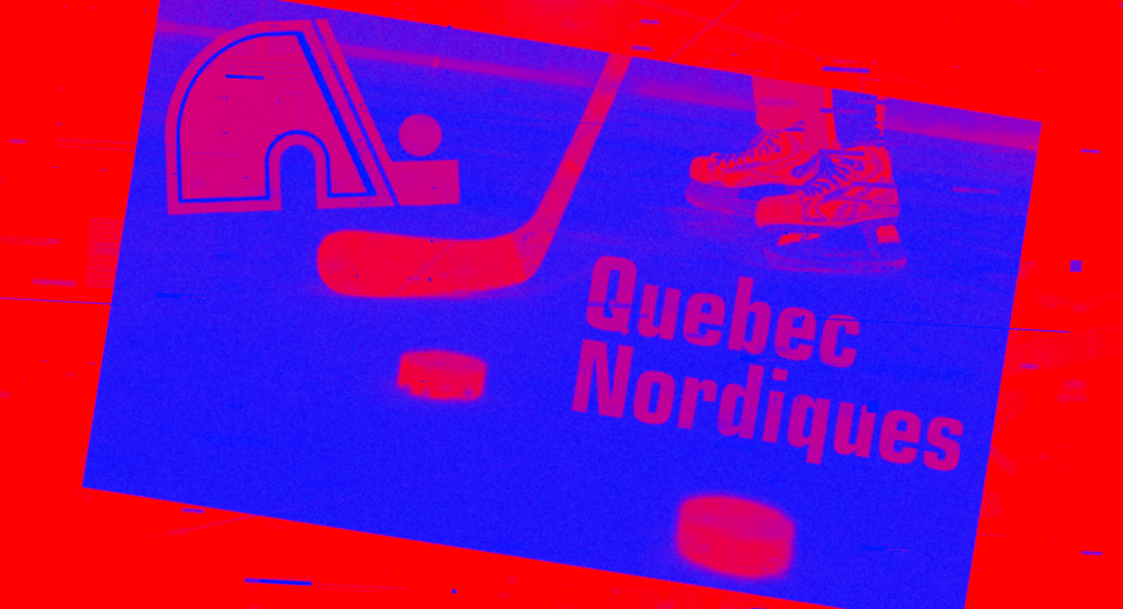
The Quebec Nordiques were a beloved professional ice hockey team based in Quebec City, Canada, known for their passionate fan base and rich history in the sport. Throughout their existence, the Nordiques wore distinctive blue and white uniforms adorned with a unique igloo-inspired logo, which became a symbol of Quebecois hockey pride.
What’s In A Name?
The Quebec Nordiques name holds a special place in the annals of hockey history and remains a cherished symbol of the sport’s legacy in Quebec City. The franchise was established in 1972 as a member of the World Hockey Association (WHA), a competing league to the National Hockey League (NHL). The Nordiques eventually became one of the four WHA teams to merge into the NHL in 1979. The team adopted the name “Nordiques,” which is French for “Northerners,” a reflection of the northern climate and French-Canadian heritage of the region. The name resonated deeply with the local population, and it quickly became synonymous with hockey in Quebec.
Throughout their history, the Quebec Nordiques maintained a passionate and dedicated fan base. The team’s iconic blue, white, and red igloo logo became an emblem of pride for the province of Quebec. The Nordiques’ rivalry with the Montreal Canadiens, another storied franchise in the NHL, was one of the fiercest in hockey, adding to the team’s allure and significance. Despite facing challenges such as financial difficulties and player departures, the Quebec Nordiques remained beloved by their fans, who continued to support the team with unwavering loyalty.
The Igloo
The Quebec Nordiques logo is a striking and memorable design that holds a special place in the hearts of hockey fans. Featuring a blue, white, and red color scheme, the logo is anchored by a stylized igloo or “iglou” in French, holding a hockey stick, which serves as the central element. The igloo, in it’s simplicity, is a nod to the northern climate and rugged landscapes of Quebec, and it embodies the team’s name, “Nordiques,” which translates to “Northerners” in English. The logo captures the essence of Quebec’s French-Canadian heritage and its strong connection to the northern regions of the province.
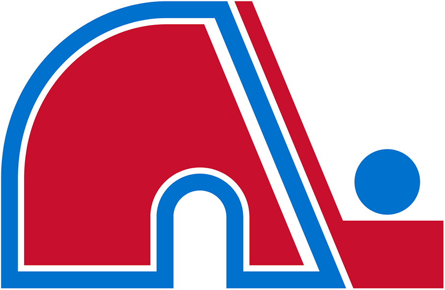
One of the most distinctive features of the Quebec Nordiques logo is the incorporation of an igloo’s entrance tunnel, which cleverly forms the letter “N” for “Nordiques.” This subtle yet creative design element adds depth and symbolism to the logo, emphasizing the team’s identity while creating an instantly recognizable visual signature. The color palette, with blue as the dominant hue, represents the team’s primary color, while red and white accents add contrast and evoke a sense of national pride, aligning with the French-Canadian culture.
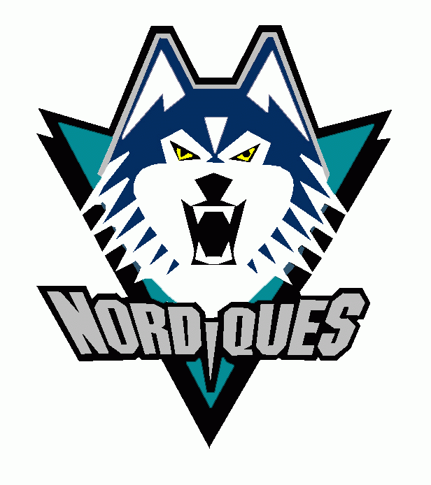
Even though the “Igloo” logo had become one of the most iconic logos in sports, the Nordiques almost rebranded completely before the 1995 season. They were set to introduce a reimagined Quebec jersey that would feature a growling Husky, that was very reminiscent of the Mighty Ducks logo that had been introduced just a few seasons before. The team’s colors were also set to be completely rebranded, going from the traditional blue and red jersey to a more navy blue, and teal color (a very popular 1990’s color palette choice). However, designs of the new jerseys leaked to local newspapers, and the fans predictably were not thrilled with the new designs. The rebrand wouldn’t have mattered much anyways, as the owners were in the midst of selling the franchise to new owners who were set to move the Nordiques to the United States.
The Nordiques Move To Denver
The relocation of the Quebec Nordiques to Denver in 1995 marked a pivotal moment in the history of both the NHL and professional sports. The Nordiques had been struggling financially for several years due to various factors, including the smaller market size and unfavorable exchange rates. The team’s ownership, led by Marcel Aubut, made the difficult decision to relocate the franchise to Denver, Colorado, where they would become the Colorado Avalanche. This move brought the NHL to the Rocky Mountains and represented the first time in 13 years that an NHL team had relocated.
The transition to Denver was a significant success for the franchise, both on and off the ice. The newly minted Colorado Avalanche quickly found success, winning the Stanley Cup in their inaugural season in Denver in 1996. Led by legendary players like Joe Sakic and Peter Forsberg, the team became a powerhouse in the NHL, solidifying Denver’s status as a hockey town. The move also demonstrated the NHL’s willingness to expand its reach into non-traditional hockey markets, paving the way for further expansion and growth of the sport in the United States.
While the Avalanche thrived in Denver, the departure of the Nordiques was a somber moment for the passionate hockey fans in Quebec City. The Nordiques had a rich history in the city, and their absence left a void that many residents felt deeply. Efforts to bring NHL hockey back to Quebec City persisted for years, with discussions about potential expansion or relocation of other franchises, but no real plans for expansion into Quebec City have been announced as of the writing of this article.
The Quebec Nordiques logo is not only a powerful emblem for the team but also a cherished symbol of Quebecois identity and hockey heritage. Even after the team’s relocation to Denver and transformation into the Colorado Avalanche, the classic Nordiques logo remains an iconic piece of hockey memorabilia and a testament to the enduring legacy of the franchise in Quebec’s rich hockey history.

Leave a comment